but, after spending hours attempting hotel bookings on sites that clearly weren’t optimised for my mobile phone, the experience is still fresh in my mind. I remember a lot of frustration, pinching and zooming to see minuscule form fields. I remember attempting to resubmit the form multiple times because I missed a field while zoomed in. I also remember this experience costing me more than just my time.
We make decisions as we design and build sites. Sometimes we decide in favour of approaches that meet our needs but cause grief for our end users. Those are mobile design mistakes and these practices need to die. Let’s talk about them.
01. Different mobile URLs
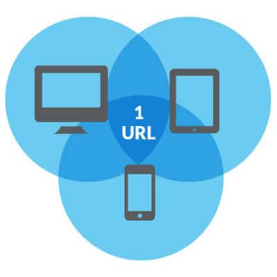 The problem is redirection. A script on your server needs to detect whether a browser is on a desktop or a mobile device. Browsers lie. During that redirect, any number of milliseconds will tick by as your script decides which site to direct you towards, then hands you off to the appropriate server. Longer loading times will affect your bottom line.
Separate URLs do enable some things that a responsive site may have a harder time accomplishing.
Smaller pages – Separate mobile URLs can be an opportunity to optimise a site for mobile performance. Wroblewski mentions breaking down pages containing multiple UI components into smaller pages with a single component per page. Less content on each page means quicker load times over a slow connection.
Source order – With separate mobile templates, you can reorder markup to your heart’s content. Nowadays, we have other ways of reflowing source order.
You can build for smaller screens server-side with a solution like RESS or client-side with libraries like Mobify.js. Ultimately, the W3C advocates its One Web philosophy of the same content at the same URL, no matter which device is used to access it. There are increasing consequences of failing to follow that approach.
02. High-density assets as default
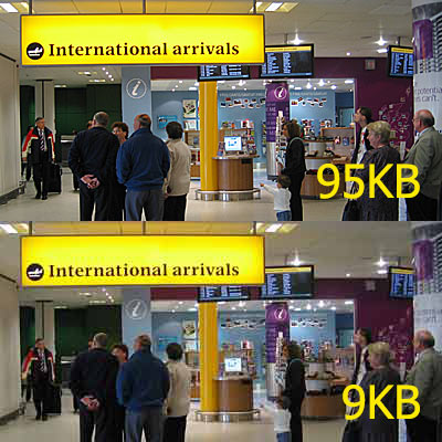 We have these new brilliantly sharp displays on our devices that make everything look amazing. So, we naturally serve the best assets we can to make our work look the best it can. Unfortunately, the increased file sizes come at a cost:
Increased loading times – Larger files take longer to load. When you consider that mobile connections are slower than desktop connections to begin with, this problem is compounded.
Heavier data plan usage – Every country has different contract terms, but your average data plan is far from unlimited. How many web pages could you visit before reaching your cap? Now quarter that number.
Roaming – If a data plan’s limit is a problem, try loading a few high density images while out of the country. My roaming rates are high enough that I don’t turn on data when I travel unless I’m, say, completely lost in the middle of the night in a bad part of town.
Decide whether you’ll provide high-resolution versions on a case by case basis. Each time you create a double-size asset, you should question whether the extra quality is worth the trade-off, or whether a lower-resolution version is really that noticeable.
03. ‘Mystery Meat’ navigation style
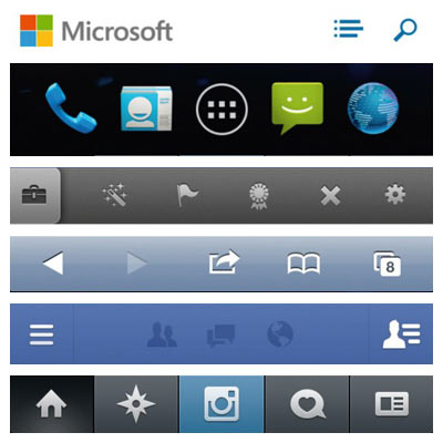 Not a new term in our industry, ‘mystery meat navigation’ was coined to categorise a usability nightmare that was quite popular in the early days of the web. Somehow we seem to be OK with unlabelled navigation icons again. A group of five buttons with no descriptive text to tell you what they do? When did that start making sense?
With so little room on your typical mobile screen for the icon bar, cramming in text labels often feels a step too far, and with mobile operating systems themselves offering many native examples of this type of navigation treatment, it’s easy to follow their example. And while we’re talking about unlabelled interactions, gestures count too. If your users need to be trained to perform a gesture, the chances of them finding it on their own are very slim.
‘Why did that happen?‘ is a great symptom of mystery meat. When users experience a behaviour that they can’t explain, it’s doubtful they understand what caused it or how they can duplicate it. Therefore, it’s unlikely to be a behaviour that they will use.
So how can we change this for the better? Visual cues are essential. If a user is expected to perform an action, there should be a clear visual indicator that the action exists, as well as clear hints about what sort of reaction users can expect once that action is then performed.
04. Following ‘WIMP’ tradition
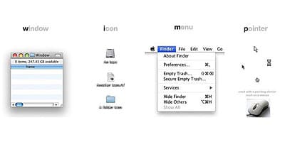 The WIMP (Windows, Icons, Menus, Pointer) user interface paradigm that Xerox pioneered decades ago has served us well, but mobile devices are really exposing its cracks. New classes of devices demand a rethink of the basics.
Windows – Multiple windows don’t make sense on a small screen. We instead use tabs as an organisational tool to present views of different content. Modern devices offer multi-tasking, but the most popular operating systems remove the need to manage windows by only ever presenting a single one at any given time.
Icons – Some upcoming CSS4 media queries will allow us to more precisely target a wider range of devices. As you may expect, the hover media query will apply a relevant style only if the device is capable of a hover event. The pointer query provides more information, as you’re able to distinguish between a precise pointer like a mouse, a coarse pointer like a finger, or no pointer at all like a screenreader user.
Menu – An implementation of a menu may have to adapt to screen real estate and input device. A great example of this is the select menu pattern, which is a popular way of shrinking down a menu with many options into a more compact space. The problem stems from how some mobile operating systems implement the select control as a half-screen overlay.
Pointers – Classical pointers were on-screen symbols to represent the movement of physical devices we could control, but touchscreens have removed the need for actual devices; we have become the pointers. Mouse events have equivalents on touchscreens, but the relationships are often imprecise. For example, tapping is mostly equivalent to clicking, but double-tapping is often reserved for zooming in or out instead of opening an application. You can just forget about :hover events completely.
This is only the tip of the iceberg. Our inputs and form factors are only getting more diverse, so we have to continuously rethink our existing user interface conventions.
05. Pay no attention to the ‘fold’
As an industry, we’ve spent a lot of time convincing ourselves the fold is dead. The debate is over. People know how to scroll. Right?
Well, there’s one place where it could still matter: actions connected to revenue. Any key business conversion tool like ‘Add to Cart buttons’ or ‘Get a Quote’ links should probably be visible above the fold.
Compare these two product pages:
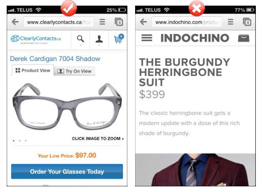
we’ve experimented with button position, and we’ve seen conversions increase when it becomes more obvious. You won’t lose truly motivated customers without a visible ‘Cart’ button, but it may just be enough to lose any would-be customers that only have a passing interest.
If you can take a given page and distill its purpose down to a single action you’d like a user to take, their ability to do so without scrolling is likely to perform better.
I introduced this article with a personal account of a bad mobile experience. It finishes with a cautionary tale. As I was describing in the beginning, after my frustrating session of booking form errors, I finally managed to book my room and receive a confirmation email. When I arrived at the hotel, I discovered they weren’t actually expecting me.
Let’s stop racking up the debt. Hopefully, by reading this feature, it’ll help you to identify mobile design anti-patterns in your own work projects and thereby contribute to improve the mobile device web experience for all of us.

